cpsl+ Originals — Modern Hip Packs for Everyday Wear
This is a behind-the-scenes look into the creative process of building a new brand from scratch.
1. Brand Name
I came upon the term “capsule” for several reasons. The definition of capsule made sense: a small case to hold your essential items. It also reminded me of Capsule Corp. from the Dragon Ball anime series I watched as a kid. Capsule Corp. was a ubiquitous company that make highly technological pill-sized capsules that always contained something useful, anything from hover-bikes to spacecrafts.

Another thing that drew me towards the name were time capsules and the idea of timelessness. As a matter of fact, in fashion a capsule collection is a popular term for a few essential items of clothing that transcends seasons and trends by being functional.
Next, I explored unique ways to express “capsule”.
- Different spellings: Capsul, Capsol, Capsoul
- Adding a suffix: Capsol pk., capsol+ originals. “originals” stands for casual fashion as opposed to sportswear, being yourself an original
- Finalized name: cpsl+ originals (long form), cpsl+ カプセル (simplified form). The abbreviation into “cpsl” was inspired by various modern brands such as: dsptch, wandrd, mnml, nbhd. The Japanese Katakana says “capsule”.

courage, passion, spirit, live, +(grow). 5 virtues to live by.
2. Design Aesthetic
- Now that I had a name, I now needed a logo that would also work as an apparel label for our fanny packs.
- Logo/Label Design: Modern, typography based, sans serif, kanji (Japanese inspired streetwear, jiu jitsu, anime), easily identifiable, versatile applications. After researching different brands, I took inspiration from Superdry, Adidas, and Newaza Apparel brands. I settled on a logo that uses simple type and an eye-catching brand color that could easily be distinguished on a fanny pack.

After numerous variations & iterations, this was the final label design.
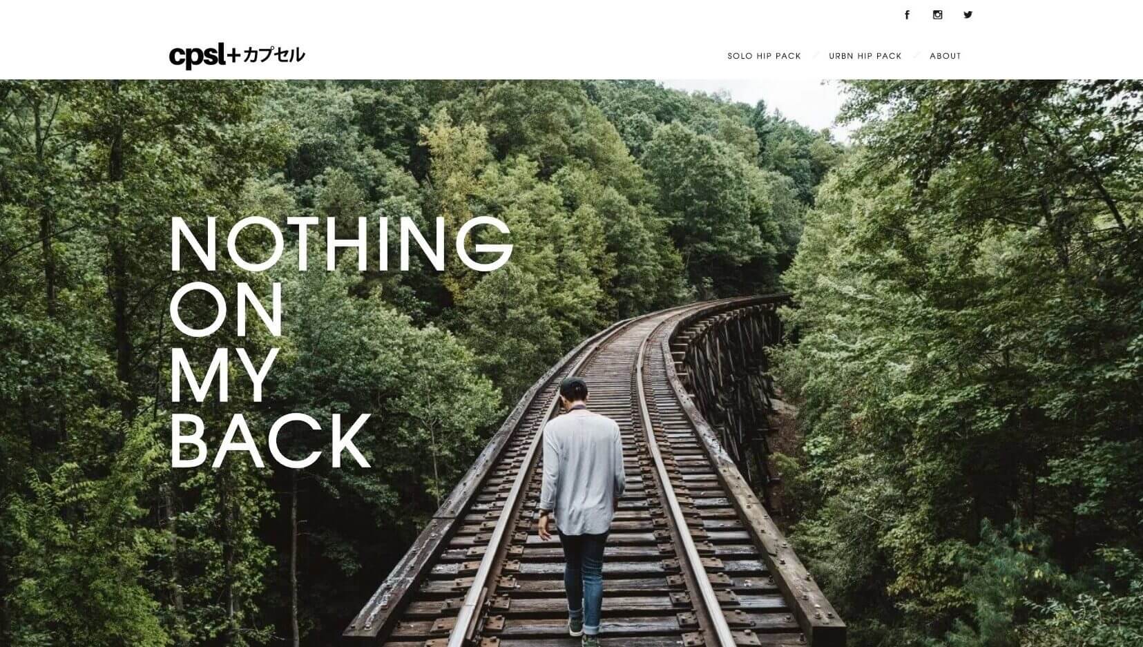
- Photographic style: Streetwear inspired, green/nature cues, outdoor active lifestyle.

With the help of some friends we were able to take some shots to use for web and social media marketing.
3. Brand Identity
Once the label design was finalized I sent it to the manufacturer to begin making the fanny packs. While that was happening, I begin work on developing the website along with brand and content (everything including taking photos, coming up with taglines, and pushing pixels).
In order to do this, I had to ask the right questions like: Who is this product for?, Why do they need the product?, and What emotions do I want to arise when seeing the brand?
- Who?: Those with active lifestyles that want a fanny pack that doesn’t look like something your mom wore in the 80’s or 90’s.
- Why do they need it?: A solution for carry your things while keeping your hands free.
- Emotions to evoke: Modern, cool, counterculture
Once I had a solid grasp of what I wanted to create with the brand, the rest of the pieces just fit into place and something that started as an idea in my head came into fruition as a living product and brand.
4. Brand Applications
Website and Social Media

Header Design for Product Detail Page
[View Demo]

Landing Page Design

Instagram: @cpsl_originals
Lifestyle Apparel Shots

cpsl+ Originals Solo Hip Pack

cpsl+ Originals Urbn Hip Pack


